What we'll cover
The anatomy of a stock chart
Four trends beginners should look for
Some words and phrases to know before investing
In the old days, stockbrokers made their living primarily because they were the only ones with quick access to the information needed to make intelligent stock buys. Today, that information is available almost instantly to anyone.
The trick is to understand that information, which is a different skill. Those who use stockbrokers and financial advisors are paying them for that skill. The rest of us can learn to read stock charts and use tools to make investment decisions ourselves.
Your 5-point quickstart guide to reading a stock chart
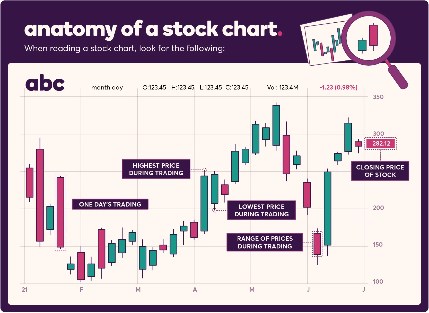
1. The top half
The top of a stock chart is a procession of vertical bars, running in time from left to right. Each bar represents a period, often one day’s trading.
The top of each bar represents the highest price at which the stock was purchased during that period. The bottom of the bar represents the lowest price of its trading during that period. Between them, you can see the range of prices people paid to purchase a share of the stock in a given time range.
Each bar also has a horizontal line running through it. This line is the price at which the stock closed for that period.
If the line is near the bottom of the bar, which shows the price closed at lower than its trading average for the period. If it’s near the top of the bar, it shows the stock performed well during that period.
By looking at and understanding this half of the stock chart, you get a sense of the stock’s price performance for a given period and over a longer term.
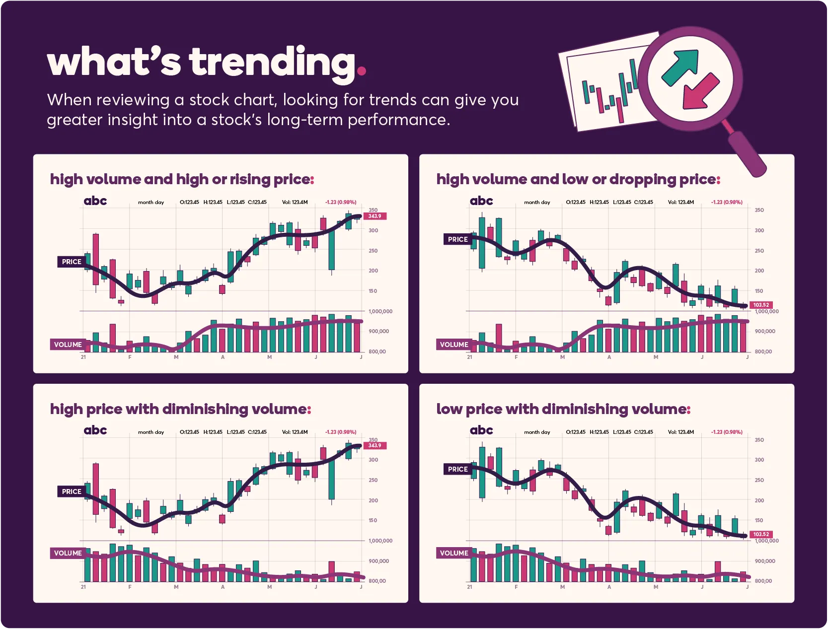
2. The bottom half
The bottom of a stock chart is a more traditional bar graph, showing the trading volume for the same period represented by the bars in the top half. Although most stock news focuses on price, the volume of trade may also be used in determining your next steps.
By combining the insights from this half of the chart with the price information above it, you can watch for some combinations that lead you to determine about whether or not you should consider buying a stock.
For beginners, here are four of the most important trends to look for:
High volume and high or rising price indicate a stock is trending upward and is likely to do so for a while.
High volume and low or dropping prices indicate the opposite. Something has soured the market on that stock, and you may lose money by buying it.
High price with diminishing volume indicates exhaustion. The rising trend is likely to slow and halt shortly. This will probably lose money despite recent gains.
Low price with diminishing volume shows the drop in value may be slowing or stopping. Sometimes, this means there’s an opportunity for reliable or rapid profit if the stock recovers.
3. The trend line
On both halves, you’ll often also see a line running approximately through the middle of the bars that looks like the sort of line graphs you’re used to seeing. You might also see a chart showing just this line.
Each data point on that line represents the mean price for a given period, and the course of the line as a whole shows the value history of the company.
You want to ignore the small hills and valleys it takes. That’s a facet of every stock, everywhere — the equivalent of static behind an important radio signal. Instead, you want to focus on three things:
1. Its Historical Performance. Is the line generally moving upward or downward? If it’s trending up, that’s a sign of a potentially good purchase option. If it’s trending down, that’s a sign you should avoid it absent other information.
2. What’s Happening Now. Over the past few months, is the stock trending upward or downward? Don’t just consider this in terms of short-term performance, but also in the context of historical performance. If the stock always has a dip after Christmas, you shouldn’t worry too much about a Christmas price drop since that’s a normal part of that stock’s business cycle. Just remember that historical performance is not always an indicator of future performance.
3. Large Spikes and Drops. Look at any points where the stock price drops precipitously or rises dramatically, and do your research to find out what happened around that time. If a stock price plummeted because it split, that might be a good sign. If it dropped and never recovered when a competitor entered the field, that’s less encouraging. Was that uptick the result of a cyclical product release? Or was it from a one-time event whose repetition is less easily predicted?
Generally speaking, the trend line gives you insights or directs you to research opportunities to help understand the context of the stock’s price over time.
4. The other trend line
Some charts include multiple trend lines based on different calculated periods. This goes back to studying averages in middle school.
Take, for example, these prices for an imaginary stock over the past two weeks: $110, $115, $120, $115, $110, $90, $80, $60, $70, $80, $95, $95, $100 and $105.
All useful trend lines use the most recent days of trading, but the number of days can dramatically impact the result. For the prices given above:
A three-day mean would be ($95 + $100 + $105) / $3 = $100.
A seven-day mean would include the slump for a result of $86.
A 14-day mean includes both the slump and the higher values before it for a result of $96.
The good news here is that multiple trend lines will clearly label the period each considers. Standard lines show 10-week and 40-week moving averages. The differences between them are definitely for more experienced traders, but you should know why multiple trend lines appear, what they mean and what fuels the difference.
5. Relative strength line
This line usually appears between the top and bottom halves. It compares the stock’s performance for that period to the S&P 500’s. It shows you whether the stock is leading the market or lagging behind other stocks.
If the line is rising, it shows the stock is outperforming the market overall. If it’s dropping, it shows the stock isn’t performing as well as most other stocks. That performance is no guarantee of failure or success in the coming weeks, but it is another strong data point to analyze when considering whether or not you may want to buy the stock.
Next-step glossary
Once you understand these basics and have tested yourself on live stock charts in real time, you’re ready to take your stock analysis skills to the next level.
Begin that journey by learning a few important terms you have to know before taking that plunge:
Ask: The lowest price an investor is willing to sell a stock for
Bid: The highest price an investor is willing to pay for a stock
Dividend Yield: How much a stockholder might receive in annual dividends, typically expressed as a percentage of the price
Line of Resistance: The price of a given stock is unlikely to rise above based on past performance
Line of Support: The price a given stock is unlikely to fall below based on past performance
Market Capitalization: The total value of a stock based on its stock price multiplied by the number of existing shares
Price-to-Earnings (P/E) Ratio: A comparison of how much money a stock earns for shareholders to how much it costs to buy a share
Of course, these definitions aren’t all you need to know about any of these terms. They’re just a place to start so you’re ready for the next stage of your stock trading education.
Nancy Whitefield is a New York-based finance writer who covers the stock market.